Branding & Identity, Print, Copywriting
Typeface Calendar
This project was completed in Fall 2018 as part of an assignment at the University of North Texas. The task was to create a physical item that could be sent to a potential client or employer to showcase our personal branding and a variety of talents. I have a passion for typography, print design, copywriting, and wordplay so I designed a calendar with a different typeface for each month. Each page includes the font information, type designer or foundry, and a description including the typeface’s history and several hidden puns. The calendar is completely handmade.

Typeface calendar with shipping envelope. Like the calendar, the envelope handmade. It is a reinforced bubble mailer to keep the calendar from bending or the wires from being crushed or otherwise damaged. The front side of the envelope has the shipping information and postage.

The front of the calendar. The title, "You're My Type," serves two purposes: showing interest in working with the recipient, and establishing the use of puns throughout the calendar. There are 12 letters in the title, and each one is a different typeface corresponding with the months.

The first page of the calendar. The flip side of every page has a pattern featuring all of the typefaces used. The "JK" image mark is in a different spot on each page.

January. Futura PT Book & Bold, by Paratype. Copy reads "Futura was designed by Paul Renner in 1927. Still a prevalent typeface after 90 years, it's clear why it has been—and will be—popular throughout the past, present, and Futura."

February. Mrs. Eaves OT Roman, by Emigre. Copy reads "Mrs. Eaves was designed in 1996 by Zuzana Licko. Adapted from Baskerville, its low x-height and unique ligatures make a display typeface that's eavesy to use. Named after John Baskerville's wife, this transitional serif appeals to eaveryone."

March. Minion Pro Regular & Italic, by Adobe Originals. Copy reads "Minion was designed by Robert Slimbach in 1990. Its name references the traditional point size names used for typefaces. Despite being the default on many Adobe programs, it's still one in a Minion."

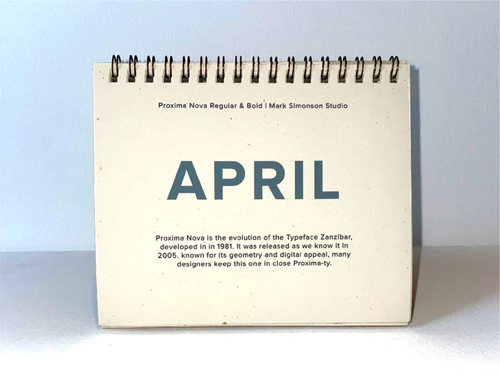
April. Proxima Nova Regular & Bold, by Mark Simonson Studio. Copy reads "Proxima Nova is the evolution of the typeface Zanzibar, developed in 1981. It was released as we know it in 2005. Known for its geometry and digital appeal, many designers keep this one in close proxima-ty."

May. Trade Gothic Next LT Pro Compressed, by Monotype. Copy reads "Trade Gothic was developed in 1948 by Jackson Burke, and its large counters and varied typefaces have made it a trick of the trade for print designers. Its versatility has allowed it to remain popular over 70 years later, and many designers wouldn't trade it for the world."

June. Playfair Display Regular & Bold, by Claus Eggers Sørensen. Copy reads "Released in 2011, Playfair Display is relatively young. Its inspiration, however, draws from older sources such as the work of John Baskerville. Popular in print headlines, this iconic typeface plays fair with others."

July. Rockwell STD Light & Bold, by Monotype. Copy reads "In the early 1900s, woodcut slab serif typefaces were notoriously hard to carve out. Rockwell was released in 1934 as an easy-to-use modification of Litho Antique and, well, it rocks."

August. Lato Regular & Light, by Lukasz Dziedzic. Copy reads "This humanist typeface was designed in the summer of 2010 and means "summer" in Polish. Lato soared to popularity after being added to Google Fonts and is now the third most popular web font. See you lato, summer."

September. Times New Roman Regular & Italic, by Monotype. Copy reads "Times New Roman was developed in 1929 for London's Times newspaper and became popular amongst other printers who wanted to get with the times. It's grown so popular that it's quite clear we're still in the Times New Roman empire."

October. Cloister Black Light, by Dieter Steffman. Copy reads "Blackletter typefaces are the oldest known fonts, used in the first book made with moveable metal type in the West—the Gutenberg Bible. With this blackletter font, the world is your cloister."

November. Neue Haas Grotesk Display Pro 45 Light & 65 Medium, by Linotype. Copy reads "The Hass foundry designed Neue Haas Grotesk in the 1950's to compete with Berthold's Akzidenz Grotesk, but there's really nothing 'grotesque' about this iconic staple of Swiss design. Plus, once you make it digital, it's a Helvetica good time."

December. League Gothic Regular, by League of Moveable Type. Copy reads "League Gothic is a revival of Alternate Gothic #1, which was originally designed in 1903. It's public domain, so you're in luck—this sturdy goth is totally in your league."

